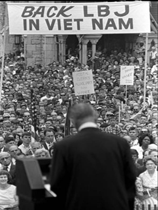
This simple starter uses just two contrasting photographs, one showing the popularity of Johnson’s policy towards Vietnam, the other opposition to it.
How can we explain the difference? Students generate questions to ask about each source before being given the answers on the PowerPoint presentation. They are left with a clear reinforcement of the need to consider the provenance of each source.
This short, but highly effective introduction raises issues about changing attitudes between 1966 and 67 and leads into a living graph showing the overall popularity of the war in each year of the decade starting in 1964.

